Data Visualization with Matplotlib#
Matplotlib is a powerful Python package widely used for creating visualizations and plots. It provides a flexible and comprehensive library for generating high-quality 2D and 3D plots, histograms, scatter plots, bar charts, and much more. In this section, we will cover the basics of using Matplotlib to create various types of plots and visualizations to aid in interpreting data.
When importing the matplotlib package, it is customary to import the plotting subpackage pyplot with the alias plt:
import matplotlib.pyplot as plt
Plotting Data#
Let’s get started by plotting a basic line plot. We can do this by creating new Matplotlib Figure using the plt.figure function and plotting some data with the plt.plot function:
# generate some data:
data_x = [ 1, 2, 3, 4  ]
data_y = [ 3, 7, 8, 12 ]

# create a new figure:
plt.figure()

# plot the x-y data:
plt.plot(data_x, data_y)

# label the axes:
plt.xlabel('X-axis')
plt.ylabel('Y-axis')

# add a title:
plt.title('Example of a Line plot')

# show plot (shows plot in Notebook)
plt.show()
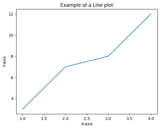
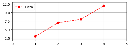
Take note that the default behavior of plt.plot is to draw straight lines between consecutive \((x,y)\) pairs, which means that you may need to ensure your x-axis and y-axis data are sorted in the correct order. Matplotlib allows you to customize various aspects of your plots, such as line styles, marker types, colors, axes limits, grid lines, legends, and more. As an example, let’s plot the same data, but with a different figure size, a customized line style, and a legend:
# change figure size:
plt.figure(figsize=(6,2))

# add a grid to the background:
plt.grid()

# plot with a special linestyle and a legend label:
plt.plot(data_x, data_y, linestyle='--', marker='o', color='red', label='Data')

# set the plot range to be [0,5] for x and [2,13] for y:
plt.xlim((0,5))
plt.ylim((2,13))

# add a legend in the upper left corner:
plt.legend(loc='upper left')

plt.show()
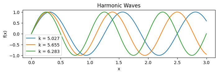
We can also plot multiple functions on the same plot. By default, Matplotlib will select different colors for each plotted function. Matplotlib can also handle Numpy arrays, which makes the plotting of mathematical functions relatively easy when we use np.linspace. For example:
import numpy as np

plt.figure(figsize=(8,2))

# visualize harmonic waves with different wavenumbers (k):
k_values = 2*np.pi * np.linspace(0.8,1.0,3)
x_points = np.linspace(0,3,1000)

# plot harmonic waves:
for k in k_values:
    y_points = np.sin(k*x_points)
    plt.plot(x_points, y_points, label=f'k = {k:.3f}')

# label axes and add title:
plt.xlabel('x')
plt.ylabel('f(x)')
plt.title('Harmonic Waves')

# add legend:
plt.legend()

plt.show()
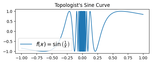
Matplotlib also supports the formatting of mathematical expressions in axes labels, titles, and text with Latex:
plt.figure(figsize=(6,2))

x_pts = np.linspace(-1,1,10000)
y_pts = np.sin(1/x_pts)

label_latex = r'$f(x) = \sin\left( \frac{1}{x} \right)$'

plt.plot(x_pts, y_pts, label=label_latex)
plt.legend(fontsize=14, loc='lower left')
plt.title('Topologist\'s Sine Curve')
plt.show()
Advanced Tip: String formatting in Python
In Python, we can format variables as string types using formatted strings, or f-strings for short. An f-string in python is a string that is preceded with the character f and contains bracketed variables that are inserted into the Python string. For example:
name = 'John Smith'
age = 25

greeting = f'My name is {name} and I am {age} years old}'
Python’s f-strings are especially useful when formatting numerical data to be displayed in the legend of a figure. In the harmonic wave example above, we used the fstring f'{k:.3f}' to convert the float type variable k to a string with no more than 3 decimal places. You can learn more about the details of f-strings in the Official Python tutorial.
Also, one other special type of string to be aware of is the raw string, or r-string for short, which was used in the label_latex string in the example above. Raw strings are preceded by the character r to signal that the string’s contents should be stored verbatim and without converting any character sequences (such as '\t', which converts to a tab, or '\n', which converts to a new line). When using Latex in your plots, use r-strings to store the Latex expressions.
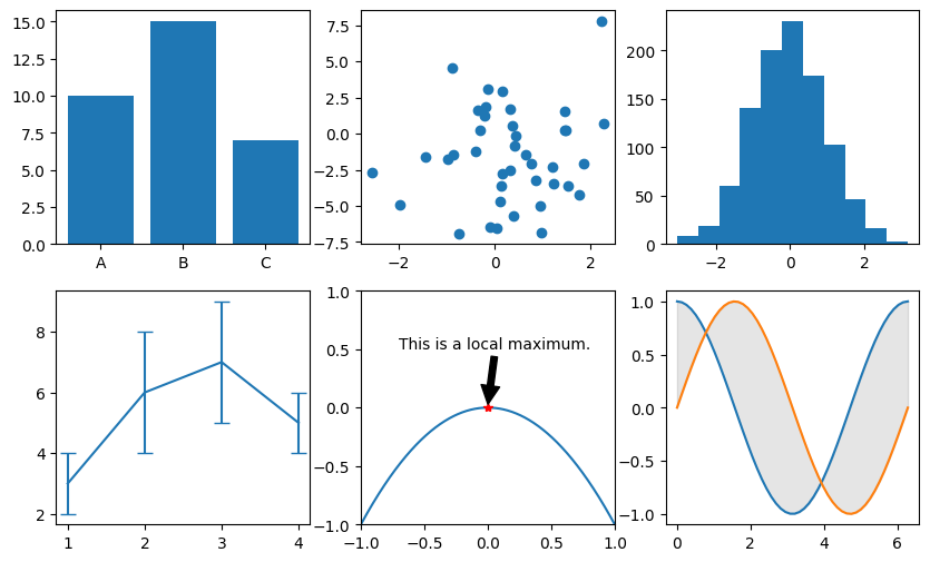
Different Types of Plots#
There are more kinds of plots and plot features you can use in addition to standard line plots. These include:
plt.bar(orplt.barh): Plots a vertical (or horizontal) bar graph.plt.scatter: Plots a scatter plot of 2D data.plt.hist: Plots a histogram for 1D data.plt.errorbar: Similar toplt.plot, but includes error bars to communicate uncertainty.plt.arrow: Plots an arrow indicating a feature of interest.plt.text: Adds text to the plot.plt.annotate: Adds text annotations to the plot.plt.fill_between: Shades the area between two curves.
Show code cell source
# seed random number generator:
np.random.seed(0)

# create a large plot to hold three subfigures:
plt.figure(figsize=(10,6))

# Subplot 1: Bar plot example
plt.subplot(2, 3, 1) # 2 rows, 3 columns, plot 1
categories = ['A', 'B', 'C']
values = [10, 15, 7]
plt.bar(categories, values)

# subplot 2: Scatter plot example
plt.subplot(2, 3, 2) # 2 rows, 3 columns, plot 2
data_x = np.random.normal(0,1,size=40)
data_y = np.random.normal(0,4,size=40)
plt.scatter(data_x, data_y)

# subplot 3: Histogram example:
plt.subplot(2, 3, 3) # (... and so on)
data_x = np.random.normal(0,1,size=1000)
plt.hist(data_x, bins=11)

# subplot 4: Errorbar example:
plt.subplot(2, 3, 4)
data_x = [ 1, 2, 3, 4  ]
data_y = [ 3, 6, 7, 5 ]
err_y =  [ 1, 2, 2, 1  ]
plt.errorbar(data_x, data_y, err_y, capsize=5)

# subplot 5: Text and annotations:
plt.subplot(2, 3, 5)
u = np.linspace(-1,1,1000)
v = -u**2
plt.plot(u,v)
plt.plot([0], [0], 'r*')
plt.xlim((-1,1))
plt.ylim((-1,1))
plt.annotate('This is a local maximum.', xy=(0,0.02), xytext=(-0.7,0.5),
            arrowprops={'facecolor': 'black', 'shrink' : 0.02})

# subplot 6: Fill between:
plt.subplot(2, 3, 6)
x_pts = np.linspace(0,2*np.pi)
y1_pts = np.cos(x_pts)
y2_pts = np.sin(x_pts)

plt.plot(x_pts, y1_pts)
plt.plot(x_pts, y2_pts)
plt.fill_between(x_pts, y1_pts, y2_pts,
                 color='black', alpha=0.1)

plt.show()
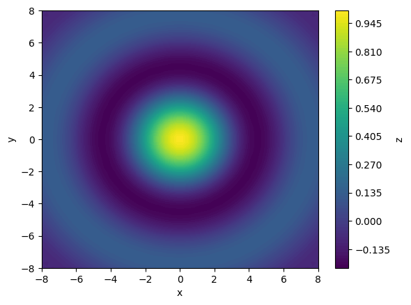
Plotting 2D Colormaps and 3D surfaces#
Matplotlib also supports visualizing function of two variables in the form of colormapping on a 2D plot or plotting a 3D surface. As an example, let’s plot the function:
To plot the function, we must evaluate it at every point along a 2D mesh. Fortunately, the np.meshgrid function makes this very easy. Then, using the plt.contourf function, we can plot \(z\) as a colormapped function of \(x\) and \(y\):
import numpy as np

# generate a mesh of x and y points:
x_pts = np.linspace(-8, 8, 50)
y_pts = np.linspace(-8, 8, 50)
X, Y = np.meshgrid(x_pts, y_pts)

# evaluate Z as a function  of X and Y:
Z = np.sin(np.sqrt(X**2 + Y**2)) / np.sqrt(X**2 + Y**2)

# display as a high-resolution contour plot:
plt.figure()
contours = plt.contourf(X, Y, Z, levels=80) # more levels -> higher resoltion
plt.xlabel('x')
plt.ylabel('y')

# generate a colorbar:
plt.colorbar(contours, label='z')

plt.show()
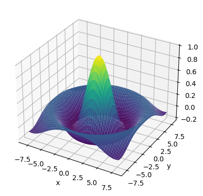
We can also visualize the same function in 3D using the following code:
Show code cell source
fig = plt.figure()

# create 3D axes:
ax = plt.subplot(projection='3d')

# plot 3D surface (from previous example):
ax.plot_surface(X,Y,Z, cmap='viridis')

# label axes:
ax.set_xlabel('x')
ax.set_ylabel('y')
ax.set_zlabel('z')

plt.show()
Saving Plots#
To save a Matplotlib plot as an image, you simply need to call the function
plt.savefig('my_figure.png')
instead of plt.show(). Matplotlib supports saving figures with the .png, .pdf and .svg file extensions. For simple plots without high-resolution colormaps, it is recommended that you use .svg or .pdf, as these file formats are not pixelated.
Exercises#
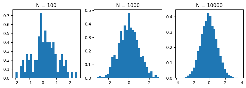
Exercise 1: Histograms
Histograms can be used to empirically visualize probability distributions based on a number of observed samples. In matplotlib, we can plot histograms from a list of 1D samples using the plt.hist function. To get some practice using this function, do the following:
Generate 100 sample datapoints from a standard normal distribution using the
np.random.normalfunction:
samples = np.random.normal(0,1,size=100)
Generate three subplots and visualize the empirical distribution of the samples using the
plt.histwithdensity=Trueandbins=30in the first subplot.Do the same for the remaining 2 subplots, but with 1000 and 10,000 samples respectively. As the number of samples increases, the histogram should more resemble the familiar “bell curve” of a normal distribution.
Exercise 3: Chaotic Dynamical Systems
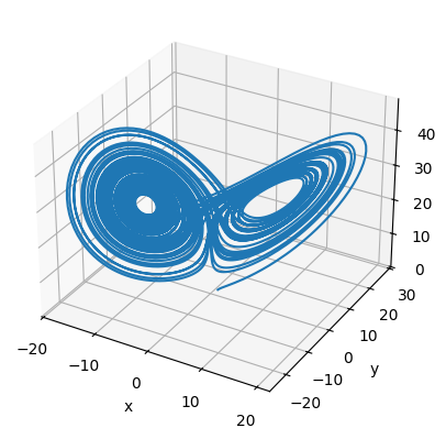
Chaotic dynamical systems are physical systems that are governed by non-linear systems of differential equations that produce trajectories which are difficult to predict. One such chaotic system is the Lorenz System, which has been used to model many different physical systems, such as fluid convection, chemical reactions, and thermosiphons. Typically, the system is written with respect to three variables:
In this exercise, we will use the canonical values \(a = 10\), \(b = 28\), \(c = 8/3\). Using the scipy.integrate.odeint function, numerically integrate this nonlinear system using the initial condition \((x,y,z) = (1,1,1)\) from \(t = 0\) to \(t = 60\). Plot the resulting trajectory on a 3D plot. You should get an interesting butterfly-shaped trajectory.
Hint: To integrate the Lorenz system, use the following code:
# define the lorenz system:
def lorenz_system(xyz, t):
    x, y, z = xyz
    return np.array([
        a*(y - x),
        x*(b - z) - y,
        x*y - c*z
    ])

# set initial conditions:
xyz_init = (1,1,1)
t_values = np.linspace(0,60,10000)

# integrate system:
trajectory = odeint(lorenz_system, xyz_init, t_values)
To plot a trajectory in 3D, use ax.plot(x,y,z) as shown in this example from the Matplotlib documentation.
Solutions#
Exercise 1: Histograms#
Show code cell content
import numpy as np

plt.figure(figsize=(10,3))

# sample sizes to plot:
sample_sizes = [ 100, 1000, 10000 ]

# visualize histogram for each sample size:
for i, N in enumerate(sample_sizes):
    plt.subplot(1, len(sample_sizes), i+1)
    samples = np.random.normal(0,1,size=N)
    plt.hist(samples, bins=30, density=True)
    plt.title(f'N = {N}')

plt.show()
Exercise 2: Chaotic Dynamical Systems#
Show code cell content
import numpy as np
from scipy.integrate import odeint

# set the parameters of the lorenz system:
a, b, c = 10, 28, 8/3

# define the lorenz system:
def lorenz_system(xyz, t):
    x, y, z = xyz
    return np.array([
        a*(y - x),
        x*(b - z) - y,
        x*y - c*z
    ])

# set initial conditions:
xyz_init = (1,1,1)
t_values = np.linspace(0,60,10000)

# integrate system:
trajectory = odeint(lorenz_system, xyz_init, t_values)

# Plot (x,y,z) trajectory in 3D
fig = plt.figure()
ax = plt.subplot(projection='3d')
ax.plot(trajectory[:,0], trajectory[:,1], trajectory[:,2])
ax.set_xlabel('x')
ax.set_ylabel('y')
ax.set_zlabel('z')
plt.show()