Statistics Review#
Before we dive into Machine Learning, we will do a brief review of the following concepts from statistics:
Probability Distributions
The Binomial Distribution
The Normal Distribution
The Central Limit Theorem
Hypothesis Testing
The Multivariate Normal Distribution
If you are already familiar with these concepts, feel free to skip this section or to only read the sections you need to review.
Probability Distributions:#
A random variable \(X\) is a variable that can take on one of a number of possible values with associated probabilities. The set of possible values attainable by \(X\) is called the support of \(X\). In this workshop, we will use the notation \(\mathcal{X}\) to denote the support of a random variable \(X\).
Random variables are often defined as probability distributions over their respective supports. A probability distribution is a function that assigns a likelihood to each possible value \(x\) in the support \(\mathcal{X}\). Probability distributions can be discrete (i.e. when \(\mathcal{X}\) is countable) or continuous (when the \(\mathcal{X}\) is not countable). For example, the probability distribution of outcomes for rolling a six-sided dice is discrete, whereas the distribution of darts thrown at a dartboard is continuous. In this workshop, we will use the notation \(p(x)\) to denote probability distributions.
In order for a probability distribution to be well-defined, we require the distribution to be normalized, meaning all probabilities add up to 1. This means that:
The expected value of a distribution \(p(x)\), denoted \(\mathbb{E}[x]\) is given by:
The expected value of a random variable, sometimes called the average value or mean value, is the average of all possible outcomes weighted according to their likelihoods. The mean of a random variable is also often denoted by \(\mu\).
The variance of a random variable \(X\) describes the degree to which the distribution deviates from the mean \(\mu\). It is often denoted by \(\sigma^2\), and is given by:
The variance can also be computed by the equivalent formula:
The standard deviation of a distribution, denoted by \(\sigma\), is the square root of the variance \(\sigma\). Roughly speaking, \(\sigma\) measures how far we expect a random variable to deviate from its mean. As a general rule of thumb, if an outcome is more than \(2\sigma\) away from \(\mu\), it is considered to be a statistically significant deviation.
The Binomial Distribution:#
The binomial distribution is a discrete probability distribution that models the number of successes in a set of \(N\) independent trials, where each trial succeeds with a fixed probability \(p\). A random variable \(X\) that is binomially distributed has support \(\mathcal{X} = \{ 0, 1, ..., N \}\) and probability distribution:
Note
We emphasize that \(p(x)\) is not the same as \(p\). \(p\) is the probability of success within any single, independent trial (experiment), so that \((1-p)\) is the probability of failure in any trial. We interpret \(p(x)\) as the probability that in a set of \(N\) trials, exactly \(x\) trials are successful, and \(N-x\) trials are failures.
Let’s write some Python code to visualize a Binomial distribution. We can compute the probability distribution by hand, or we can use the scipy.stats.binom.pmf function:
Show code cell source
import numpy as np
from scipy.stats import binom
import matplotlib.pyplot as plt

N = 10  # number of trials
p = 0.3 # probability of trial success

# evaluate probability distribution:
x_support = np.arange(N+1)
x_probs = binom.pmf(x_support, n=N, p=p)

# plot distribution:
plt.figure()
plt.xticks(x_support)
plt.bar(x_support, x_probs)
plt.xlabel('x')
plt.ylabel('p(x)')
plt.show()
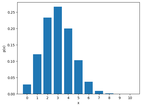
The mean and variance of this distribution are \(\mu = Np\) and \(\sigma^2 = np(1-p)\) respectively.
The Normal Distribution:#
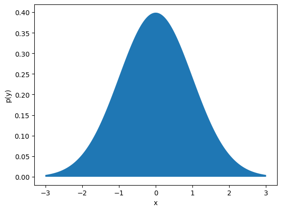
The normal distribution (also called the Gaussian distribution) is perhaps the most important continuous distribution in statistics. This distribution is parameterized by its mean \(\mu\) and standard deviation \(\sigma\) and has support \(\mathcal{X} = (-\infty, \infty)\). The distribution is:
If we plot this distribution (using scipy.stats.norm.pdf), we obtain the familiar “bell curve” shape:
Show code cell source
import numpy as np
from scipy.stats import norm
import matplotlib.pyplot as plt

mu = 0.0 # mean of distribution
sigma = 1.0 # standard deviation of distribution

# evaluate probability distribution:
x_pts = np.linspace(mu-3*sigma, mu+3*sigma, 1000)
x_probs = norm.pdf(x_pts, loc=mu, scale=sigma)

# plot distribution:
plt.figure()
plt.fill_between(x_pts, x_probs)
plt.xlabel('x')
plt.ylabel('p(y)')
plt.show()
The Central Limit Theorem#
The Law of Large Numbers and the Central Limit Theorem are two important theorems in statistics. The Law of Large Numbers states states that as the number of samples \(n\) of a random variable \(X\) increases, the average of these samples approaches the distribution mean \(\mu = \mathbb{E}[X]\):
The Central Limit Theorem generalizes the Law of large numbers. It states that for a set of \(n\) independent samples \(x_1, x_2, ..., x_n\) from any random variable \(X\) with bounded mean \(\mu_X\) and variance \(\sigma_X\), the sample mean random variable \(\bar{X}_n \sim \sum_{i=1}^n x_i/n\) is such that:
This theorem is useful for quantifying the uncertainty of the sample mean. If we divide both sides by \(\sqrt{n}\) and shift by \(\mu_X\), we see that:
In other words, the standard deviation of the sample mean \(\bar{x} = \sum_{i=1}^n x_i/n\) is roughly \(\sigma_X/\sqrt{n}\). This relation quantifies the uncertainty of using the sample mean as an estimate of a population mean.
Hypothesis Testing#
An important part of doing science is the testing of hypotheses. The standard way of doing this is through the steps of the scientific method: Formulate a research question, propose a hypothesis, design an experiment, collect experimental data, analyze the results, and report conclusions. In the analysis of our data, how do we know if our hypothesis is correct? There are many different statistical methods we can apply to test a given hypothesis, each with different strengths and weaknesses. In machine learning, we often use hypothesis testing to determine (hopefully with a high degree of certainty) whether one model is more accurate than another. We can also use hypothesis testing to determine which data features are more significant than other data features when making predictions.
Typically, hypothesis testing involves two competing hypotheses: the null hypothesis (denoted \(H_0\)) and the alternative hypothesis (denoted \(H_1\)). The null hypothesis often is a statement of the “status quo” or a statement of “statistical insignificance”. The alternative hypothesis is the statement of “statistical significance” we are often trying to prove is true. To better illustrate the process of hypothesis testing, we will use the following example:
Example: Conductor vs. Insulator Classifier#
Suppose we are developing a classifier model that predicts whether a material is a conductor or an insulator. For simplicity, we shall assume that roughly half of all materials are insulators and half are insulators. Our two competing hypotheses would then be:
\(H_0\): The accuracy of our classifier is the same as random guessing (accuracy = 0.5)
\(H_1\): The accuracy of our classifier is better than than random guessing (accuracy > 0.5)
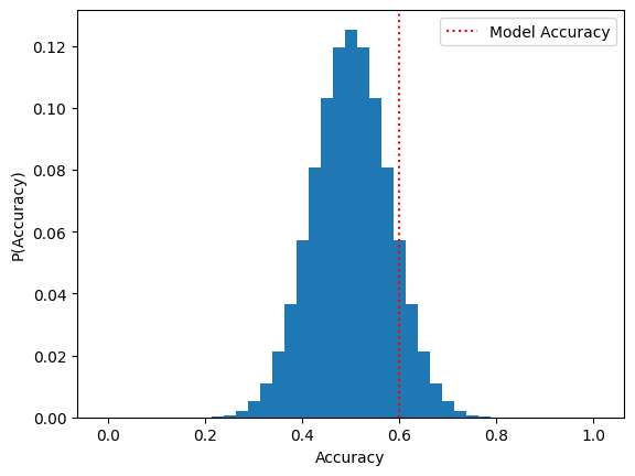
Suppose that in order to test our alternative hypothesis \(H_1\), we compile a dataset of 40 materials (20 conductors and 20 insulators) and use these to evaluate our model. We find that the model has an accuracy of 0.6, meaning it correctly classifies \(60\%\) of the dataset. Since the accuracy is greater than 0.5, does this mean we immediately reject \(H_0\) in favor of \(H_1\)? Not necessarily; it could be the case that our model simply got lucky and “randomly guessed” the classification of more than \(50\%\) of the dataset.
First, let’s consider the distribution of accuracies that could be attained by a random guessing strategy. If we treat each guess as one of \(N = 40\) trials with a probability \(p = 0.5\) of succeeding, we can model the distribution of random guessing strategies with a binomial distribution. Let’s write some Python code to visualize this distribution:
Show code cell source
import numpy as np
from scipy.stats import binom
import matplotlib.pyplot as plt

# experiment parameters:
N = 40
p_guess_correct = 0.5
model_accuracy = 0.6

# evaluate distribution:
n_correct = np.array(np.arange(N+1))
probs = binom.pmf(n_correct,n=N,p=p_guess_correct)
accuracies = n_correct / N

# plot distribution
plt.figure()
plt.bar(accuracies, probs, width=1/N)
plt.axvline(x=model_accuracy, color='r', ls=':', label='Model Accuracy')
plt.xlabel('Accuracy')
plt.ylabel('P(Accuracy)')
plt.legend()
plt.show()
In order to evaluate whether or not our result is statistically significant, we will compute the \(p\)-value associated with our hypothesis testing. A \(p\)-value is a quantity between \(0\) and \(1\) that describes the probability of obtaining a result at least as extreme as the experimentally observed value assuming that \(H_0\) is true. Roughly speaking, we can interpret a \(p\)-value as the probability of observing the experimental data “by coincidence” if \(H_0\) is in fact true. If a \(p\)-value is low, it means that the alternative hypothesis \(H_1\) is likely to be true. In most research settings, a p-value of at most \(0.05\) (\(5\%\) chance of coincidence) is considered sufficient to show that the alternative hypothesis \(H_1\) is true.
From inspecting this plot we see that the accuracy distribution is approximately normal, having mean \(\mu_X \approx p = 0.5\) and variance \(\sigma^2_X \approx p(1-p) = 0.25\). Per the Central Limit Theorem, we conclude that the estimated accuracy of random guessing is normally distributed with mean \(\mu = \mu_X\) and \(\sigma = \sigma_X/\sqrt{40}\). The \(p\)-value corresponds to the area under this normal distribution curve corresponding to accuracies with \(0.6\) or greater. Using the values from the previous code cell, we can compute the \(p\)-value as follows:
Show code cell source
from scipy.stats import norm

# plot approximate normal distribution via CLT:
mu_clt = p_guess_correct
sigma_clt = p_guess_correct*(1-p_guess_correct)/np.sqrt(N)

# evaluate CLT normal distribution:
x_pts = np.linspace(mu_clt-4*sigma_clt, mu_clt+4*sigma_clt, 1000)
x_probs = norm.pdf(x_pts, loc=mu_clt, scale=sigma_clt)

# determine region to the right of estimated accuracy:
pval_pts = x_pts[x_pts > model_accuracy]
pval_probs = x_probs[x_pts > model_accuracy]

# estimate pvalue:
pvalue = 1 - norm.cdf(model_accuracy, loc=mu_clt, scale=sigma_clt)

# plot CLT normal distribution and shade region
# to the right of estimated accuracy:
plt.figure()
plt.plot(x_pts, x_probs, 'k')
plt.fill_between(pval_pts, pval_probs, label=f'p-value: {pvalue:.3f}')
plt.axvline(x=model_accuracy, color='r', ls=':', label='Model Accuracy')
plt.legend()
plt.show()
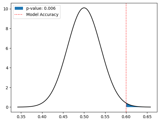
Since the \(p\)-value is \(0.006 \le 0.05\), we conclude that the \(H_1\) is true, meaning the accuracy of our model (\(0.6\)) being greater than random guessing (\(0.5\)) is statistically significant. This proves that the model is better than random guessing; however it is worth noting that a model with an accuracy of \(0.6\) may not be practically useful for distinguishing between insulators and metals.
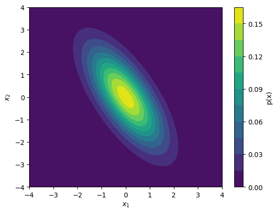
The Multivariate Normal Distribution:#
Often, we will find that we are working with multi-dimensional data where correlations may exist between more than one variable. Fortunately, these correlations can be described by a multivariate normal distribution. Like the 1-dimensional normal distribution, the multivariate normal distribution is characterized by two parameters, a mean vector \({\boldsymbol{\mu}}\) and a covariance matrix \(\mathbf{\Sigma}\). For a \(d\)-dimensional distribution, these parameters can be written in matrix form:
(For a review of matrices and matrix-vector products see the next section.) The entries \(\mu_i = \mathbb{E}[X_i]\) are the coordinates of the mean \(\boldsymbol{\mu}\). The entries \(\sigma_i^2 = \mathbb{E}[(X_i - \mu_i)^2]\) in \(\Sigma\) are the variances of each individual component of the distribution. Finally, the off-diagonal components \(\sigma_{ij}\) are the covariances of components \(i\) and \(j\). The covariance of two components is given by:
The probability distribution of a multivariate normal distribution is given by:
Note
From the definition of \(\text{Cov}(X_i, X_j)\), it follows that \(\text{Cov}(X_i, X_j) = \text{Cov}(X_j, X_i)\). This means that the covariance matrix \(\mathbf{\Sigma}\) is symmetric (\(\mathbf{\Sigma} = \mathbf{\Sigma}^T\)), having up to \(d(d+1)/2\) distinct values that need to be determined.
For any two random variables, if \(\text{Cov}(A,B) = 0\) the random variables are uncorrelated; otherwise, the sign of \(\text{Cov}(A,B)\) indicates whether \(A\) and \(B\) are positively or negatively correlated.
Also, for the multivariate normal distribution to be well-defined, we must impose that the matrix \(\mathbf{\Sigma}\) is invertible. If \(\mathbf{\Sigma}\) is not invertible, \(\det(\mathbf{\Sigma}) = 0\), which means \(p(\mathbf{x})\) cannot be normalized.
To evaluate the density of a multivariate normal distribution, we can use the scipy.stats.multivariate_normal.pdf function:
Show code cell source
import numpy as np
from scipy.stats import multivariate_normal
import matplotlib.pyplot as plt

# mean of distribution:
mu = np.array([ 0.0, 0.0 ])

# covariance matrix of distribution:
sigma = np.array([
    [  1.0, -1.0 ],
    [ -1.0,  2.0 ]
])

# define 2D mesh grid:
x1_pts = np.linspace(-4,4,100)
x2_pts = np.linspace(-4,4,100)
x1_mesh, x2_mesh = np.meshgrid(x1_pts, x2_pts)
x12_mesh = np.dstack((x1_mesh, x2_mesh))

# evaluate probability density on mesh points:
prob_mesh = multivariate_normal.pdf(x12_mesh, mean=mu, cov=sigma)

# plot distribution:
plt.figure()
plt.contourf(x1_mesh, x2_mesh, prob_mesh, levels=10)
plt.xlabel(r'$x_1$')
plt.ylabel(r'$x_2$')
plt.colorbar(label='p(x)')
plt.show()
Exercises#
Exercise 1: Comparing Two Classifiers:
Consider the Conductor vs. Insulator Classifier example from above. Suppose that after some additional work, we propose an improved classifier model, which we think can classify materials with an accuracy greater than \(0.6\). We now have the following two Hypotheses:
\(H_0\): The accuracy of the improved classifier is the same as the original classifier (accuracy = 0.6)
\(H_1\): The accuracy of the improved classifier is the greater than the original classifier (accuracy > 0.6)
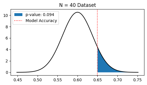
Suppose we evaluate the accuracy of the improved classifier with a dataset of only 40 materials, and find that \(26\) of the \(40\) materials are classified correctly. Repeat the same analysis as before to determine whether \(H_1\) is true and report the \(p\)-value.
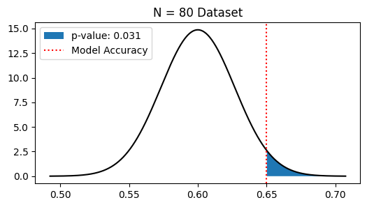
Next, suppose that we instead used a dataset of \(80\) materials and found that \(52\) of these were classified correctly (same accuracy as before, but more data). Does this change our conclusion as to whether or not \(H_1\) is true?
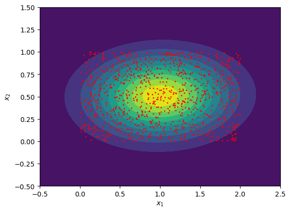
Exercise 2: Fitting a Multivariate Normal Distribution:
Generate a 2D dataset of 10,000 random points uniformly sampled within a rectangle of width \(2\) and height \(1\), where the lower left hand corner of the rectangle is fixed at the origin. You can generate uniform values on the interval \([a,b]\) using the np.random.uniform function in the numpy package.
Fit this distribution to a multivariate normal distribution by computing the sample mean vector \(\boldsymbol{\mu}\) and sample covariance matrix \(\mathbf{\Sigma}\). You can do this with the np.mean function and the np.cov functions respectively (these are also contained in the numpy package).
Plot both the generated data points and the fitted multivariate normal distribution using plt.contourf or a similar function.
Solutions:#
Exercise 1: Comparing Two Classifiers#
Show code cell content
import numpy as np
from scipy.stats import norm
import matplotlib.pyplot as plt

# Original model accuracy:
original_accuracy = 0.6

# Experimental results:
# (number correct, total)
experiment_results = [
    (26,40), (52,80)
]

# perform analysis for N = 40 and 80:
for (n_correct, N) in experiment_results:

    # compute accuracy:
    accuracy = n_correct/N

    # compute CLT mu and sigma:
    mu_clt = original_accuracy
    sigma_clt = original_accuracy*(1-original_accuracy)/np.sqrt(N)

    # evaluate CLT normal distribution:
    x_pts = np.linspace(mu_clt-4*sigma_clt, mu_clt+4*sigma_clt, 1000)
    x_probs = norm.pdf(x_pts, loc=mu_clt, scale=sigma_clt)

    # determine region to the right of estimated accuracy:
    pval_pts = x_pts[x_pts > accuracy]
    pval_probs = x_probs[x_pts > accuracy]

    # estimate pvalue:
    pvalue = 1 - norm.cdf(accuracy, loc=mu_clt, scale=sigma_clt)

    # plot CLT normal distribution and shade region
    # to the right of estimated accuracy:
    plt.figure(figsize=(6,3))
    plt.title(f'N = {N} Dataset')
    plt.plot(x_pts, x_probs, 'k')
    plt.fill_between(pval_pts, pval_probs, label=f'p-value: {pvalue:.3f}')
    plt.axvline(x=accuracy, color='r', ls=':', label='Model Accuracy')
    plt.legend()
    plt.show()

    # print out conclusion:
    if pvalue > 0.05:
        print('pvalue > 0.05, so we reject H0')
    else:
        print('pvalue < 0.05, so we accept H0')
pvalue > 0.05, so we reject H0
pvalue < 0.05, so we accept H0
Exercise 2: Fitting a Multivariate Normal Distribution:#
Show code cell content
import numpy as np
from scipy.stats import multivariate_normal
import matplotlib.pyplot as plt

# randomly sample the x1 and x2 coordinates of points:
n_data  = 1000
x1_data = np.random.uniform(0,2,n_data)
x2_data = np.random.uniform(0,1,n_data)

# combine x1 and x2 components:
x_data = np.array([ x1_data, x2_data ])
x_mean = np.mean(x_data, axis=-1)
x_cov = np.cov(x_data)

# define 2D mesh grid:
x1_pts = np.linspace(-0.5,2.5,100)
x2_pts = np.linspace(-0.5,1.5,100)
x1_mesh, x2_mesh = np.meshgrid(x1_pts, x2_pts)
x12_mesh = np.dstack([x1_mesh, x2_mesh])

# evaluate probability density on mesh points:
prob_mesh = multivariate_normal.pdf(x12_mesh, mean=x_mean, cov=x_cov)

# show plot of fitted multivariate normal distribution:
plt.figure()
plt.contourf(x1_mesh, x2_mesh, prob_mesh, levels=10)
plt.scatter(x1_data, x2_data, color='r', s=1)
plt.xlabel(r'$x_1$')
plt.ylabel(r'$x_2$')
plt.show()